Brian Mobile App
I helped improve the discussion feature inside the Brian Mobile Application.

The challenge
The challenge was to redesign only a specific feature of the Brian application: The discussion room.
This involved rethinking the entire goal of the discussion room, and the role of the business using such a feature. What is the goal of redesigning this feature? How is it going to improve our business?
Currently the way Brian is doing it is through their hard to use and - let's be honest - completely non-findable and non-usable discussion room.
The team
Brian AG is a Zurich-based startup which aim to rethink the way education is made for adults. It started its journey in the University of St-Gallen and is now expanding in various areas of education.
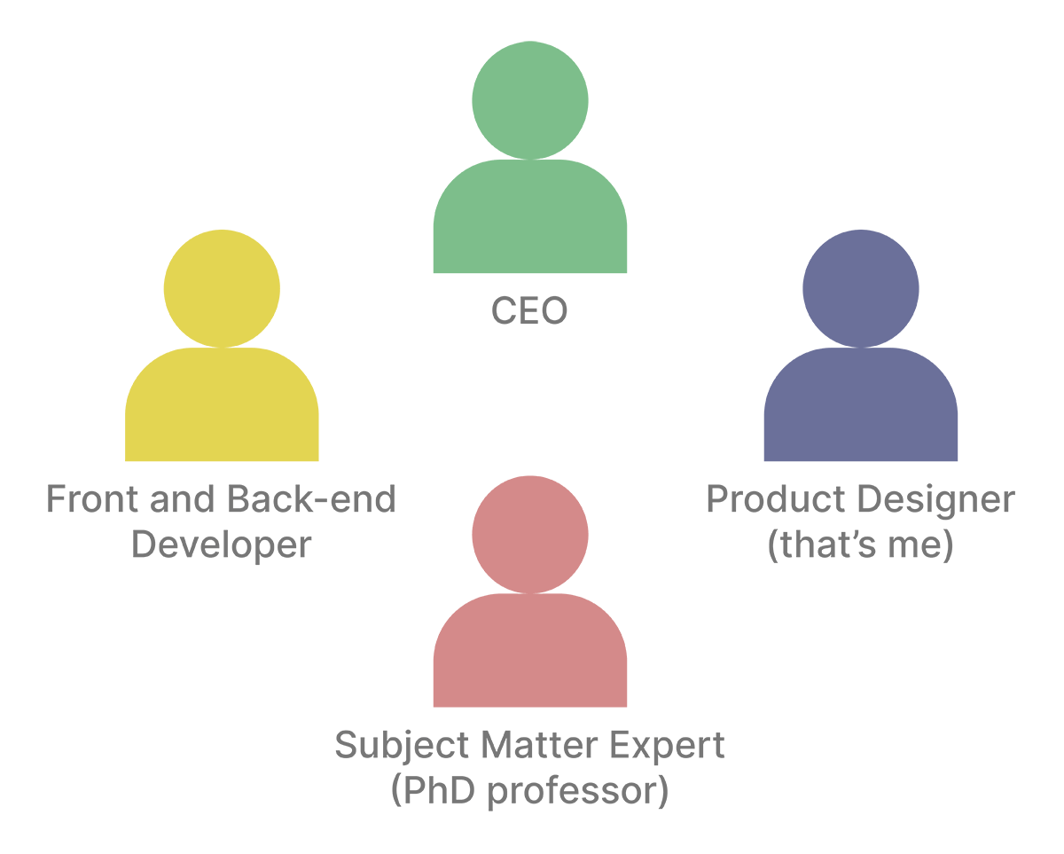
The team was composed by the CEO, a Front and Back-end Developer, a Subject Matter Expert (a PhD professor from Birmingham, UK) and myself as a Product Designer.
Test and competitive analysis
Brian is lucky enough to have a lot of customers. This meant that all the work was based on real customer feedback and interaction.
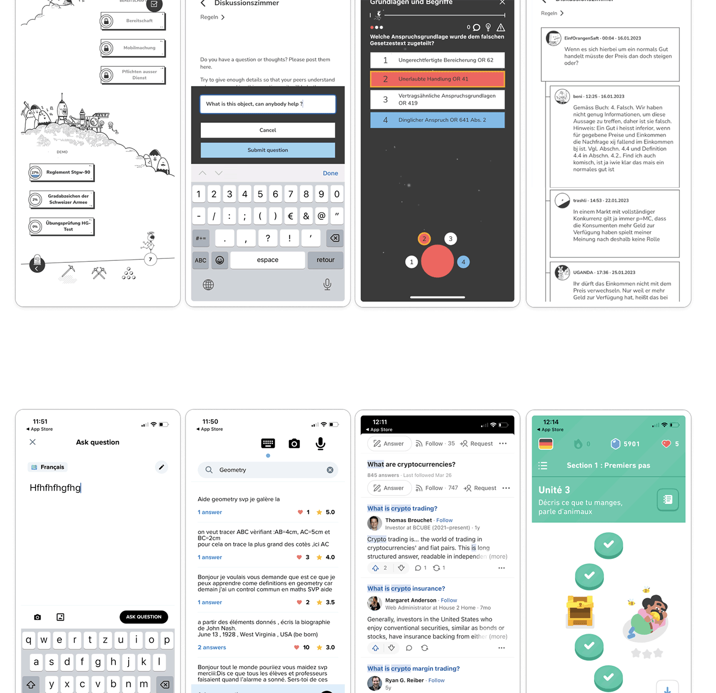
I made a brief competitive analysis and testing of other related mobile apps in the education industry to see best practises and how they operate.
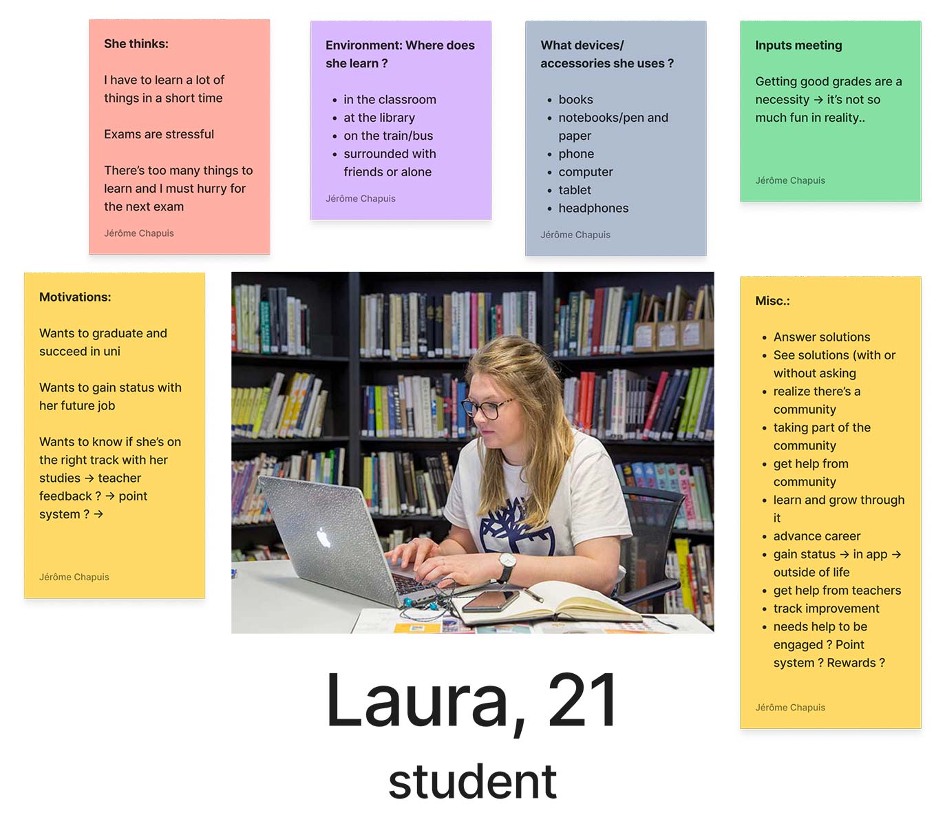
Persona & context of use - The student

Journey Map
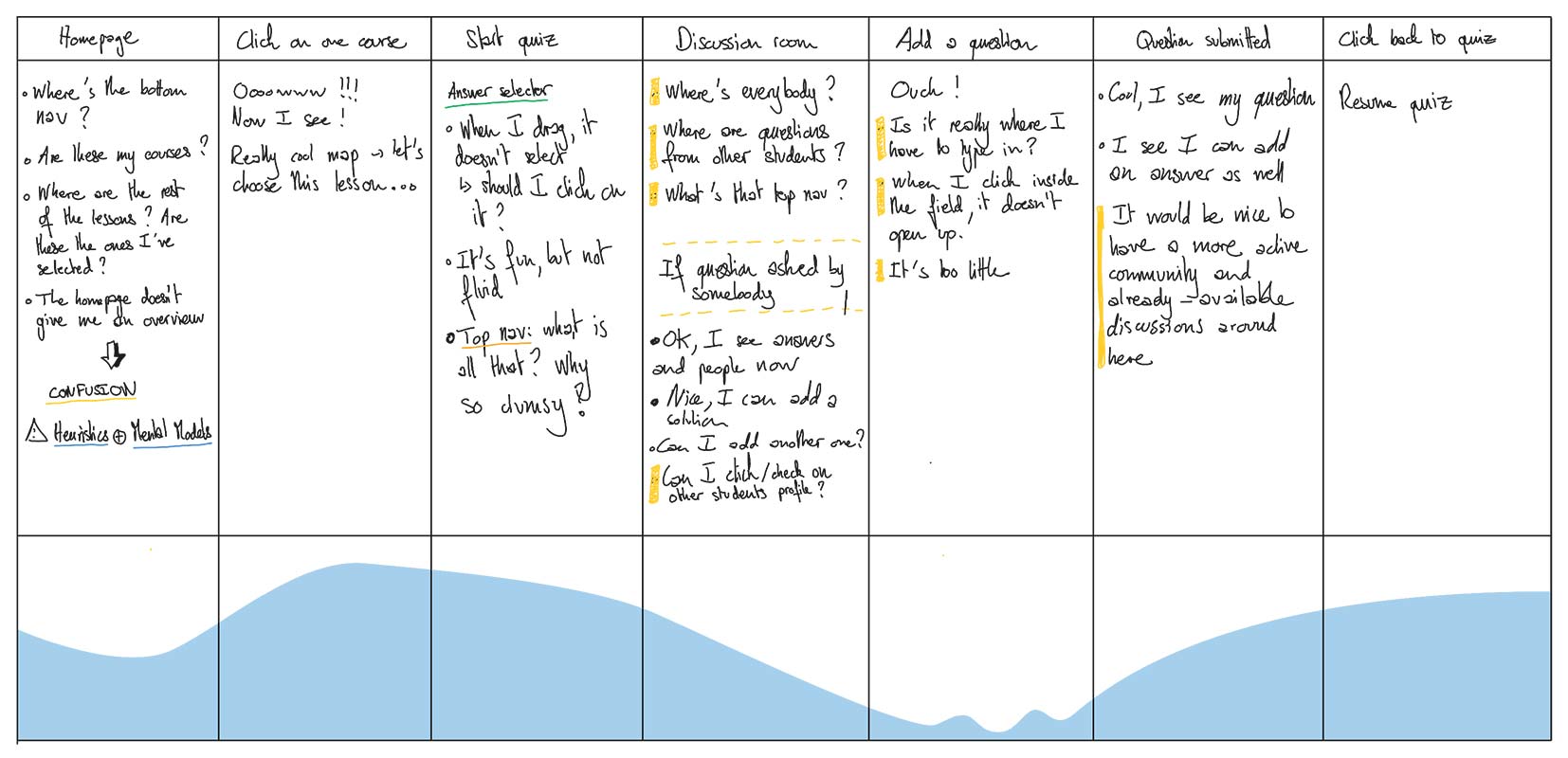
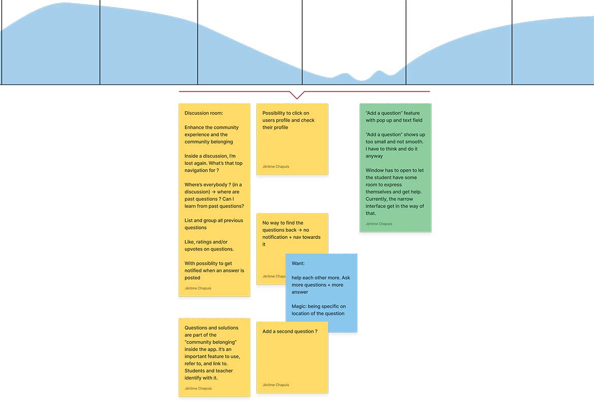
This journey map is based on the student interaction within the app. The focus has been put on the discussion room and the questions/answers the student can add or follow.
Narrowing down the focus
As a team, we decided to narrow down the focus to the key specific feature that would make an impact for our users.
Doing that together allowed me to gain a lot of clarity on what to design and why.
Sketches and generating ideas
Sketching new features and new ways to think about the discussion room
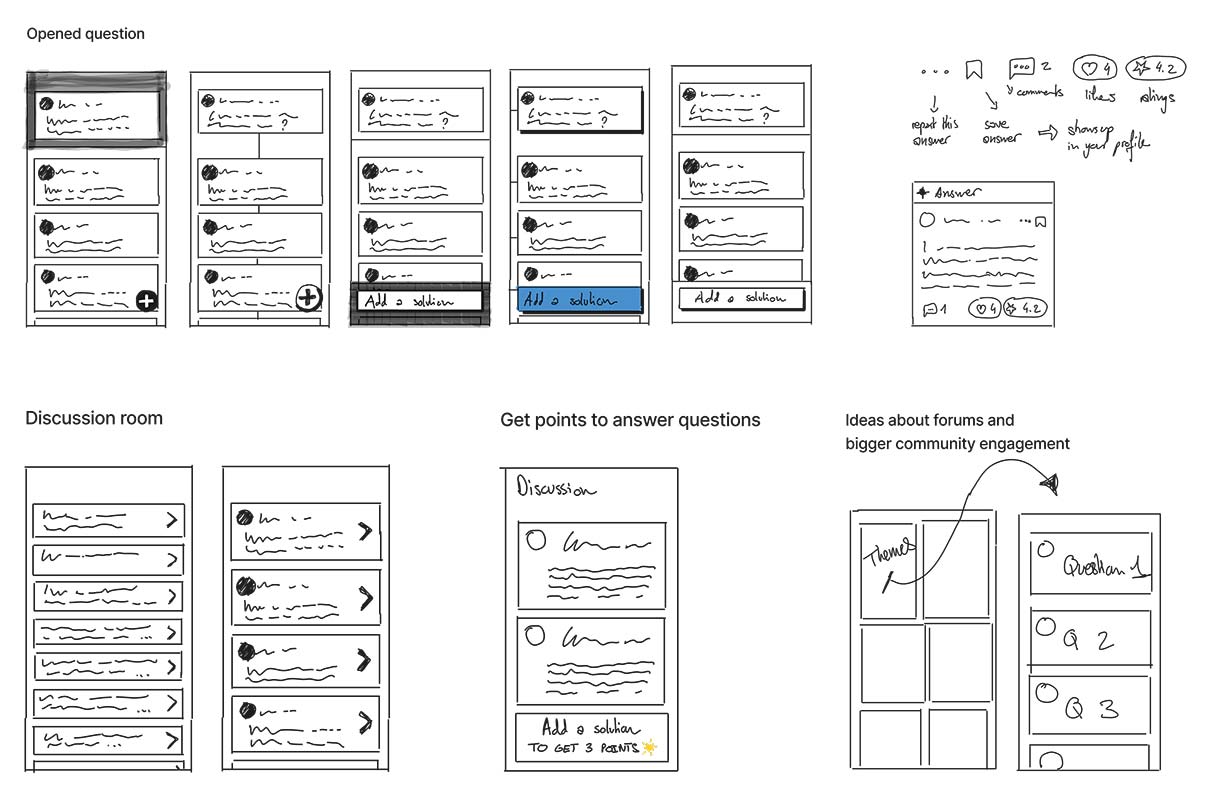
Prototypes ideas (not used)
On this "divergent phase", I like to generate ideas, even though some of them might not be used in the end. This allows us to open up to new ideas as a team.
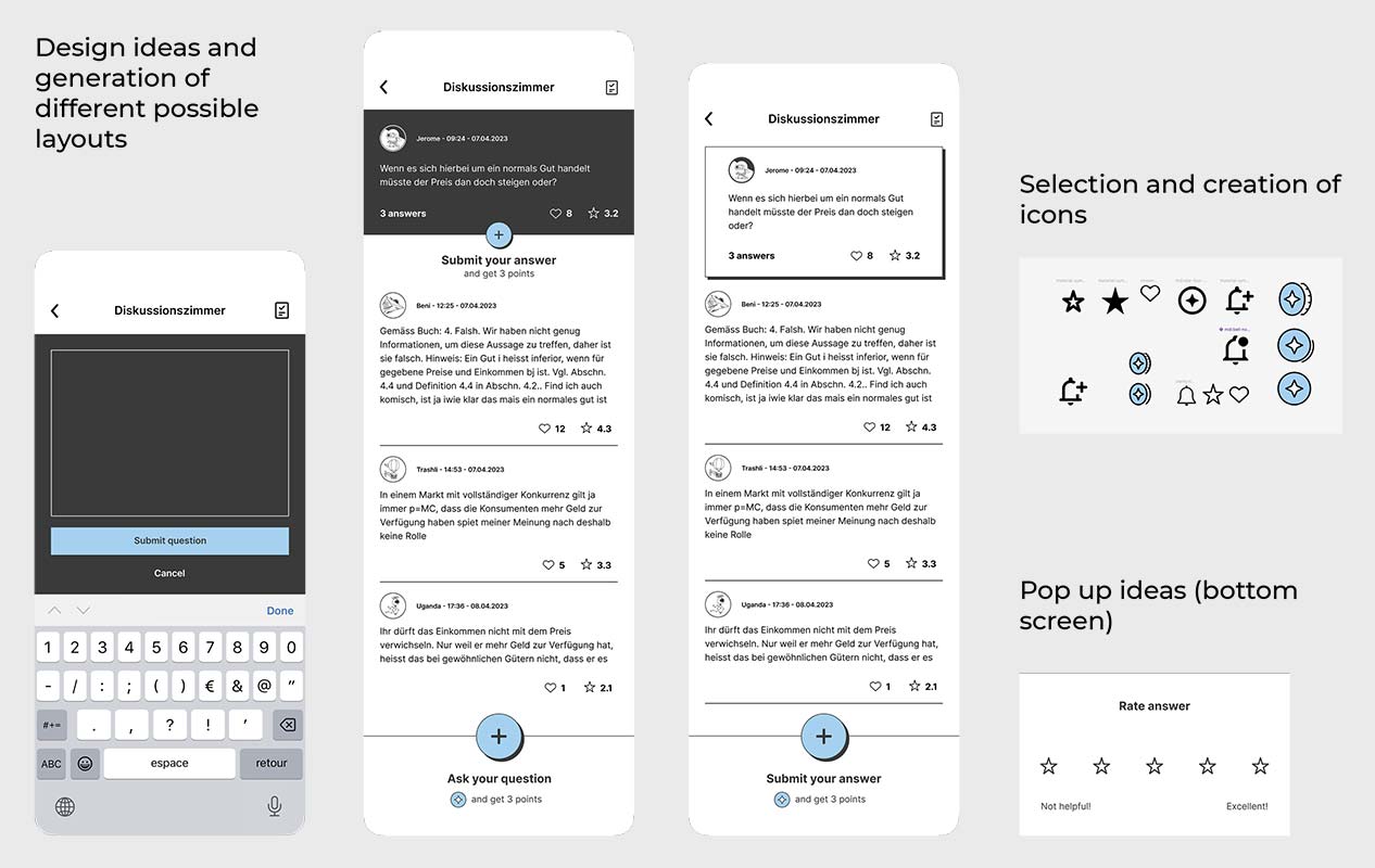
Interactive prototype
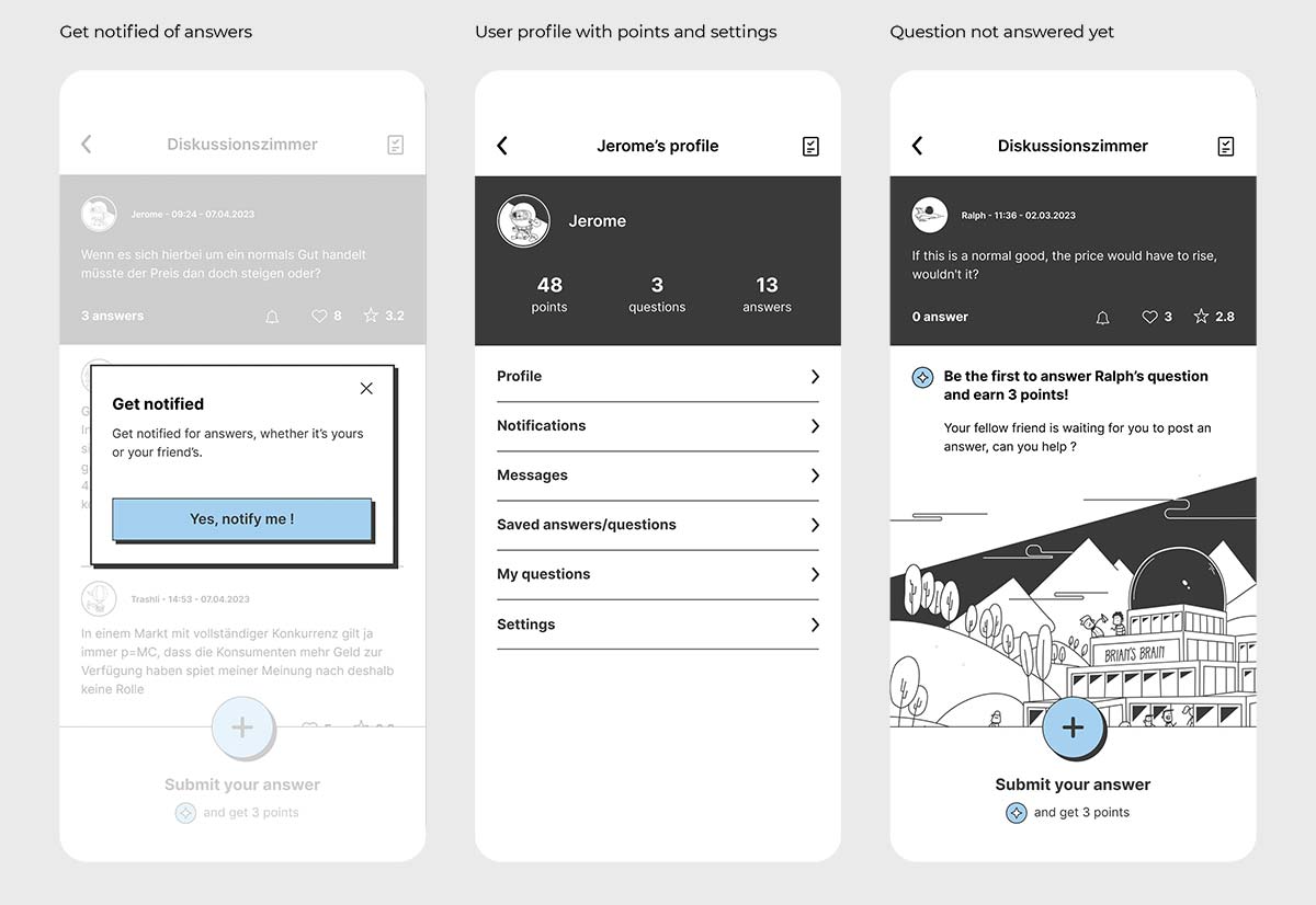
I created a fully interactive prototype to test the newly designed feature on mobile.
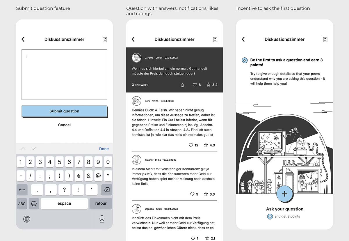
Test it live
You can test this feature right here.
Please note:
- Click on the top right "bubble icon" to start testing the feature
- When asking a question, click in the text field to continue the navigation further

